
Studying Motion Design: Reading the Language of the Explainer

Updated: 3 days ago
This subject has had me exploring the very interesting world of the explainer video, a world that encompasses a wide variety of styles like in-person long form tutorials to animated high impact short form videos. In the search for a body of work to explore, I searched topics that would grab my attention. A long YouTube search was refined down to two accounts, The School of Life (The School of Life, n.d.) and TED-Ed (TED-Ed, n.d.). Within the TED-Ed account there were a couple of videos that kept grabbing my attention. The artist all the videos had in common was Yukai Du, a London-based illustrator and animation director. Then I found a video that had me hooked from the beginning. How Small Are We in the Scale of the Universe? is narrated by educator Alex Hofeldt, animated and directed by Yukai Du (TED-Ed, 2017)
Her portfolio is filled with bold illustrations and animations that draw you into their world. Her video for MTV Idents called Anxious (Du, 2018) is a 15-second journey into how anxiety can make you feel and is a great example of her style. The whirling action and changing scenery seem to surround the central figure. And the colour palette of purple and black forces your focus on the character and somehow on the entire screen all at once. The artist uses the same techniques throughout her work. The colour palettes are allowed to change, but the hand-drawn style and use of texture stay consistent. Within the How Small Are We in the Scale of the Universe? video, the colours are used to show connection. Using the same colours in the stars and people drives home the lesson that they are linked. The textures and movement help grab your attention to certain areas, and the use of repeating circles to link us back to the beginning is a clever way to get the viewer to understand the underlying message of the video. This is the precise section I realised I was supposed to be watching for its art and animation style, not to learn about the Hubble telescope and scale of humans compared to the universe.
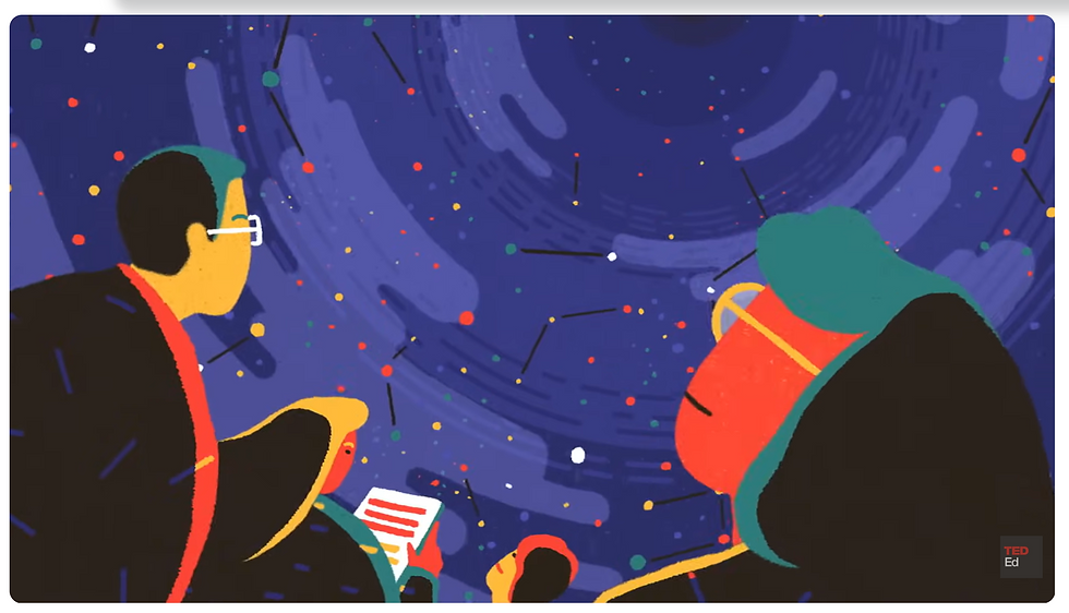
The visual system within this video revolves around its colour palette and circles which are shown in the first few seconds. The opening scene (timestamp 0:07) has a group of people gazing up to the sky. They are illustrated as if they were silhouetted against the night sky with highlights on each corresponding with a star in the sky, signifying the two are linked and introducing us to the colour palette. You hear the word “pointed” and see a character point to the direction the shot moves to next. This technique is called synchresis (Chion, 1994), when an image and sound happen simultaneously with the audience perceiving them as one thing. This is also using the voiceover to pace the scenes and allows the animation to flow to the beat. The law of continuity (Gestalt Principles, n.d.) is in play throughout this video but now we transition to the point in the sky. It’s highlighted by concentric circles in the same colours as the highlights on the people and the surrounding stars.
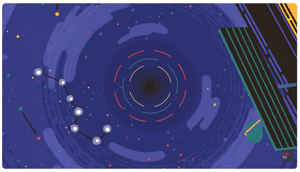
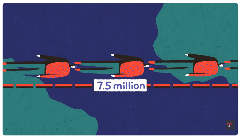
This leads us to what the telescope captured and how big that section of sky is. This is shown by a comparison of a picture (timestamp 0:49) and the tip of the pen (timestamp 1:17). The circle scales quickly to show how big the section in question is, switching from slow to fast movements to cement the point in the viewer’s mind, a twist on the slow in and slow out animation principle (Thomas & Johnston, 1981) that is frequently used in this video. To continue our lesson in scale, we are quickly shifted to a character on top of the world. We see the height written, then the earth and its size is written and finally repeats of the character lying down and the size written. This is a visual repetition of the information on size and how far the astronauts travelled. The timing of the measurements on screen lines up with the voiceover. This is an example of how the pacing of the video is managed and how the information is designed throughout the video.
This style of information design utilises a few techniques: the law of simplicity (Gestalt Principles, n.d.) is used within the colour palette and style of illustration. Repetition of circles and arcs gives us an easy flow through what could be an intimidating subject to understand. Du’s use of soft, almost crayon type textures and flickering movement provides an appeal that keeps you interested even with the stark contrast between scenes that keep us going through the video. There is a fast pace near the end of the video that feels like you are zooming through space as you listen to the voiceover. It is almost like Kahneman’s System 1 (Kahneman, 2011), your instinctively understood the video’s topic in an instant. But then it slows and we are back to the people, gazing up, with the only thing moving being the circular motion of the sky.
This joining of beginning and end is where the inspiration for my animation begins with the simple illustration style and soft, almost touchable texture also being a goal. But the question now is, what will my topic be? Some choices off the top of my head are: perfumery (how perfumes are created) or colour theory? Both match with what inspires me about Du’s style and topics that interest me. The colour theory topic could make good use of her crayon like texture and the twinkling movement would also match well with perfumery. Du’s signature style would provide some wonderful visual inspiration to both topics. Going forward with a topic that isn’t a part of the work that
goes into the development phase would allow me to focus on learning the craft of animation. The second part of this decision needs to be audience. I want my video to catch the attention of a curious person who is searching YouTube for answers and hold it for the entire time. And scent is not easy to picture, like the universe. Which Du’s techniques did so well they command my attention throughout the entire video. With that statement I think that is a decision made. Moving forward, I will explore the art of explainer videos through the topic of perfumery.
References
Chion, M. (1994). Audio-vision: Sound on screen (C. Gorbman, Trans.). Columbia University Press.
Du, Y. (n.d.). About. Yukai Du.
Du, Y. (2018, January 29). MTV artist ident – Anxious [Video]. Vimeo.
Gestalt Principles. (n.d.). The gestalt principles of design. Retrieved October 8, 2026, from
Kahneman, D. (2011). Thinking, fast and slow. Farrar, Straus and Giroux.
TED-Ed. (n.d.). Playlists [YouTube channel]. YouTube. Retrieved October 9, 2026, from
TED-Ed. (2017, February 13). How small are we in the scale of the universe? - Alex Hofeldt [Video]. YouTube.
The School of Life. (n.d.). Home [YouTube channel]. YouTube. Retrieved October 9, 2026, from
Thomas, F., & Johnston, O. (1981). The illusion of life: Disney animation. Abbeville Press.
Comments